Payever
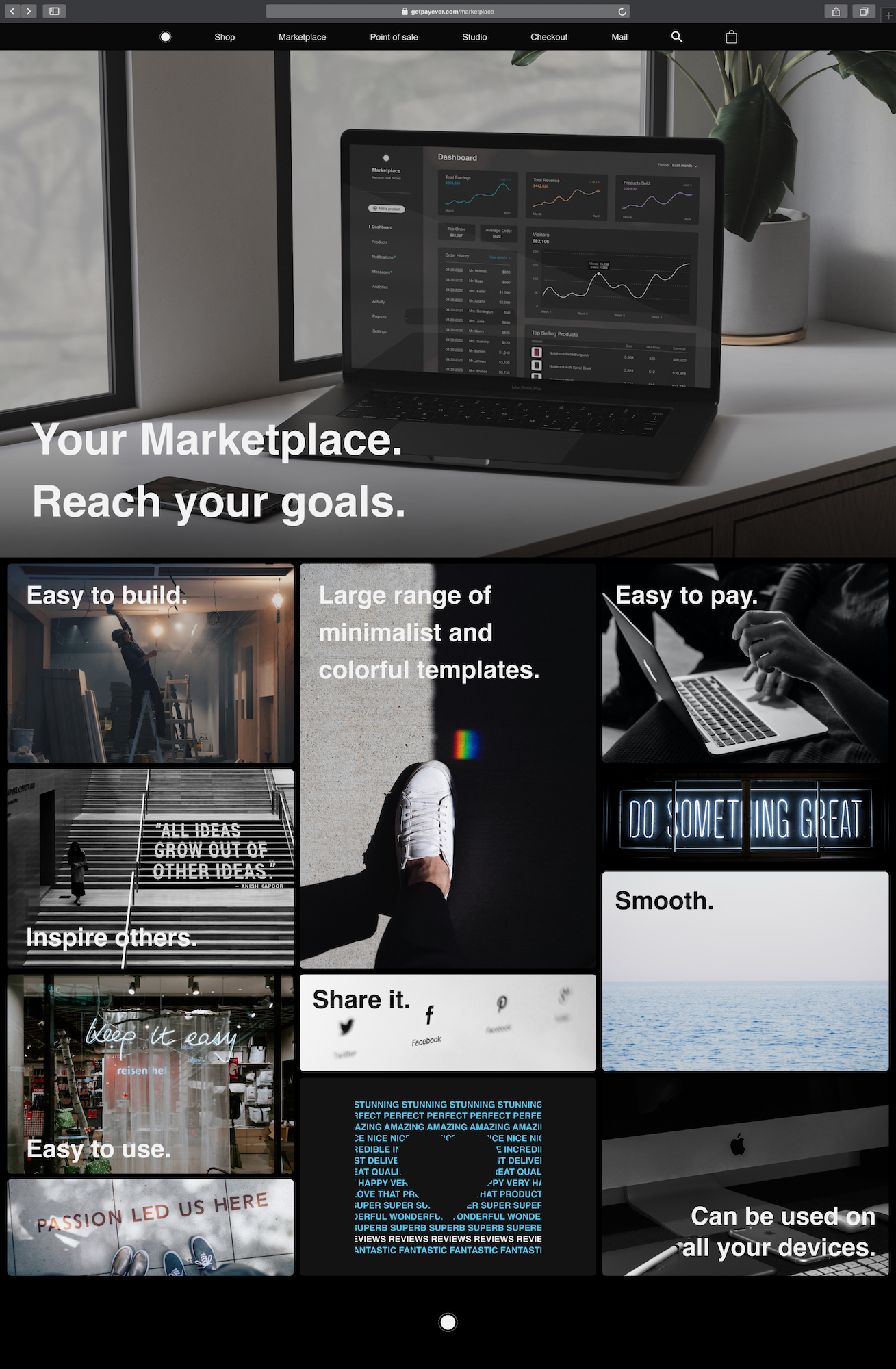
Strongly inspired by Apple’s design, their website is minimalist and elegant. For this work, I also worked on Apple’s identity and took inspiration from its universe.
2020
Payever. UX/UI Design, Marketing and Media
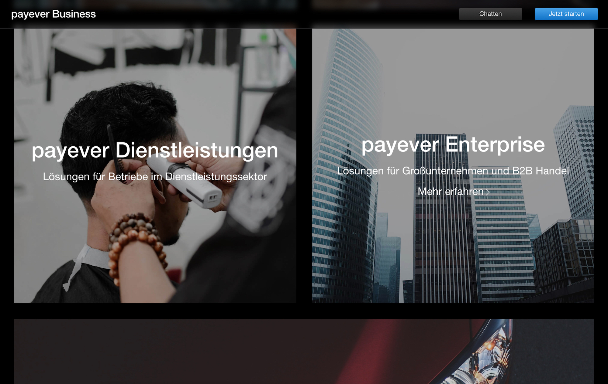
Payever is an online platform currently offering twelve different tools for businesses to help them create their online shop and promote their business through marketing and media. During a 72 hours challenge, I designed their new tool: a platform to help businesses create a marketplace and develop marketing for it.
Research
Design (Figma, Photoshop, Illustrator)
Marketing
Media
Research
Design (Figma, Photoshop, Illustrator)
Marketing
Media
Strongly inspired by Apple’s design, their website is minimalist and elegant. For this work, I also worked on Apple’s identity and took inspiration from its universe.
Create the new Payever service: a marketplace builder.
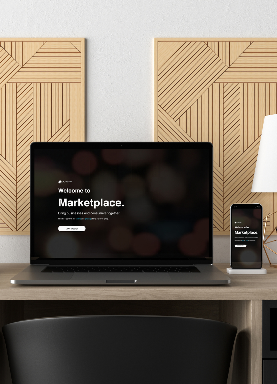
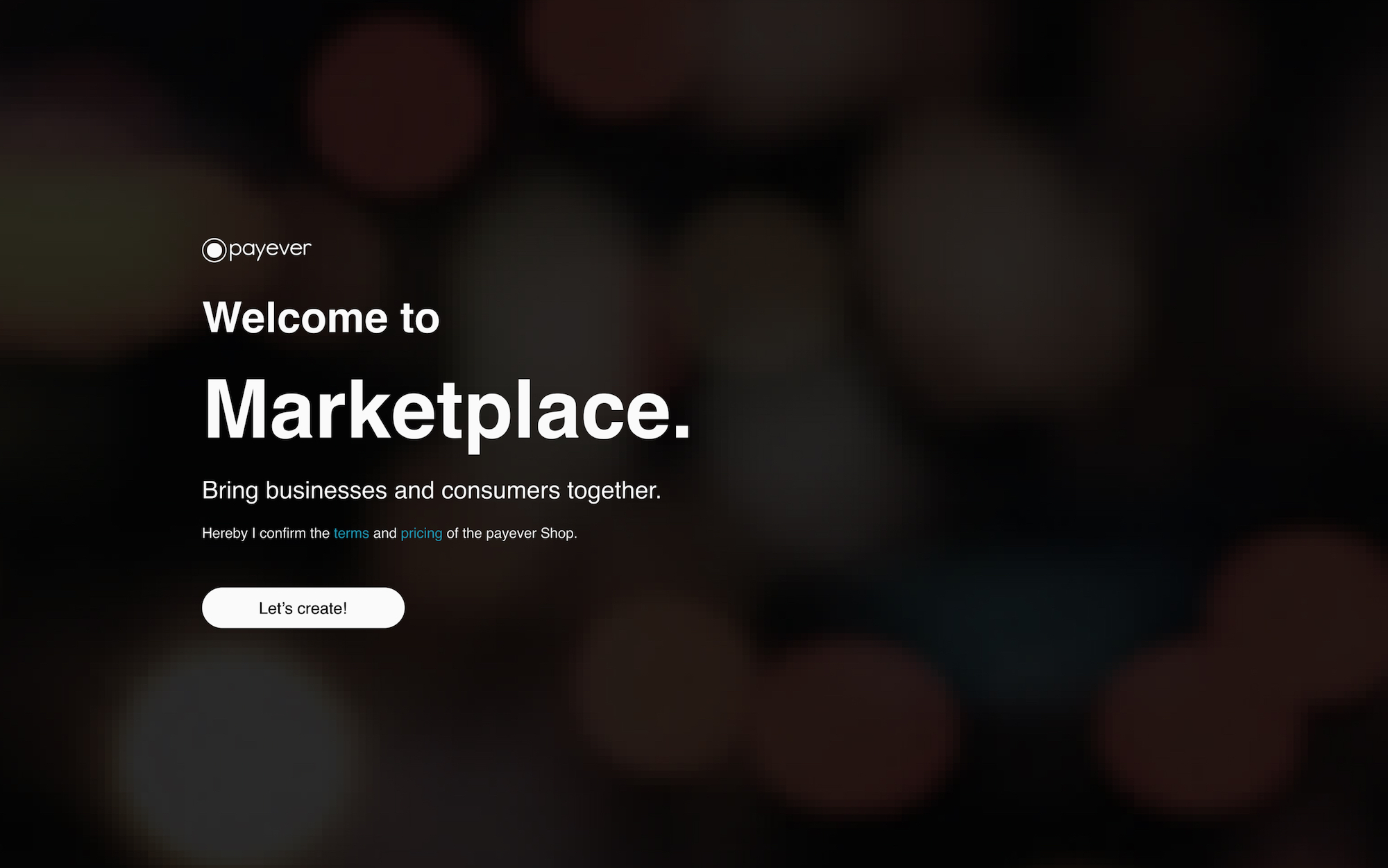
Marketplace is an online service for businesses that helps them create their marketplace and brings businesses and consumers together.
The purpose of this welcome page is to make people understand what a marketplace is at the first reading. It also shows that they will be the ones to create it.
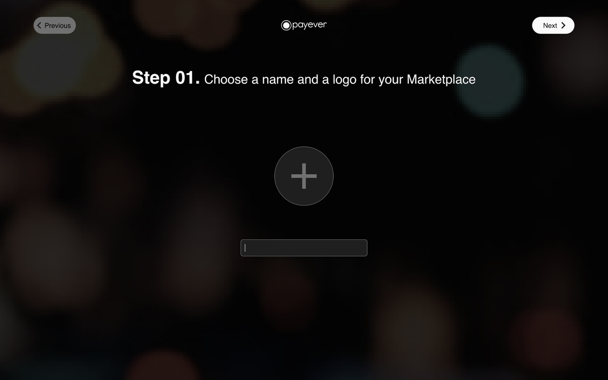
Writing steps is dynamic, and it will help the client remember what they did and when. For this first step, they have to type their marketplace’s name and drag and drop their logo.
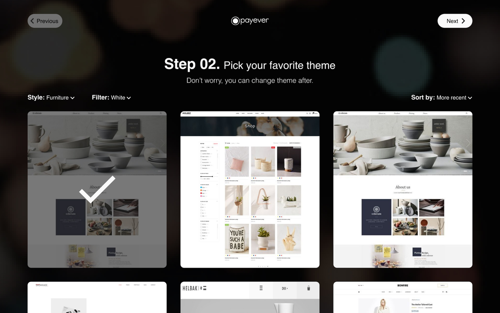
The next step for the business owners is to select their favorite theme. I added a mention saying that they could still change it later so they don’t spend too much time on this page.
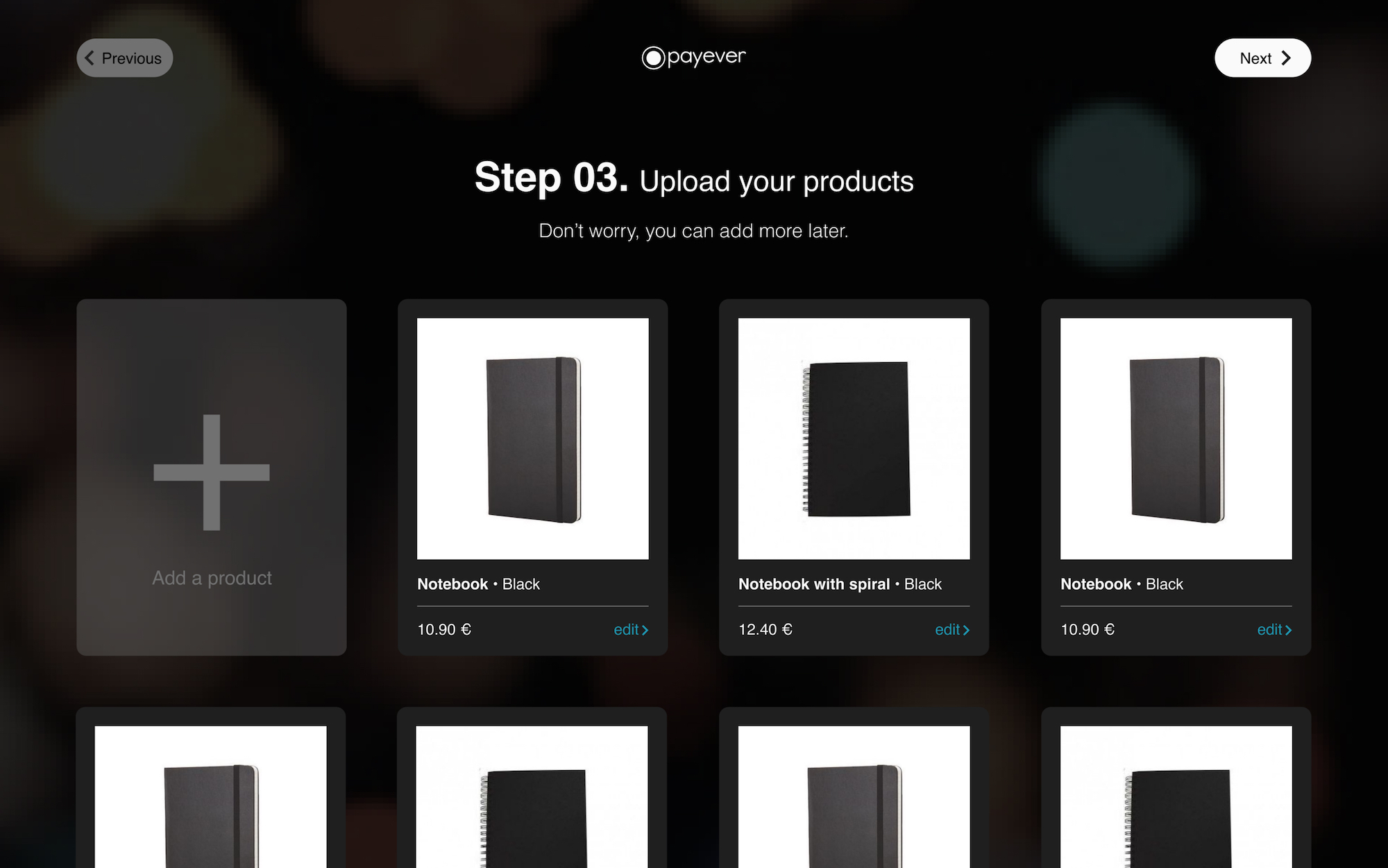
If the client also sells products, they can import them at this stage.
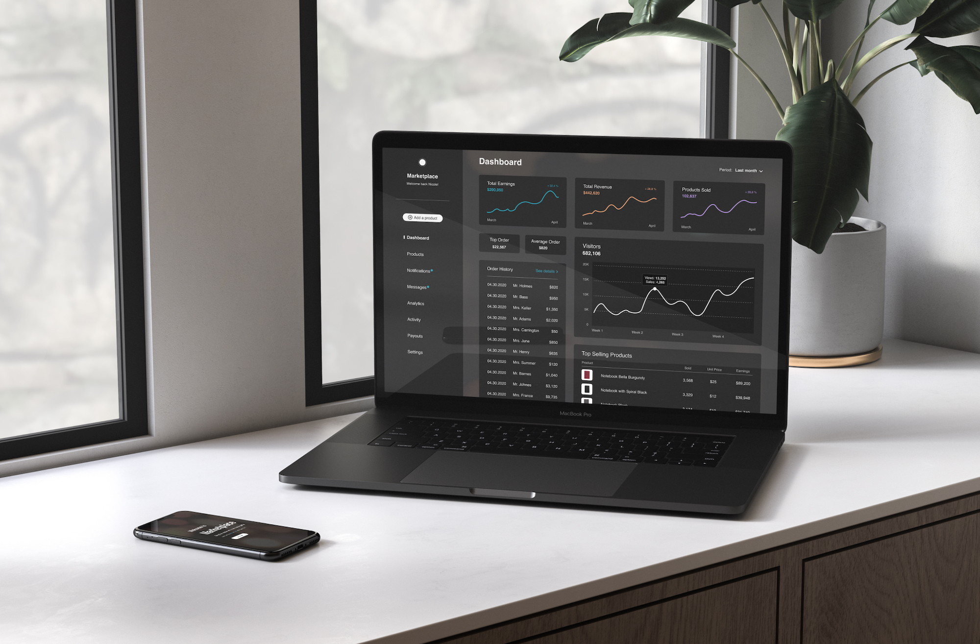
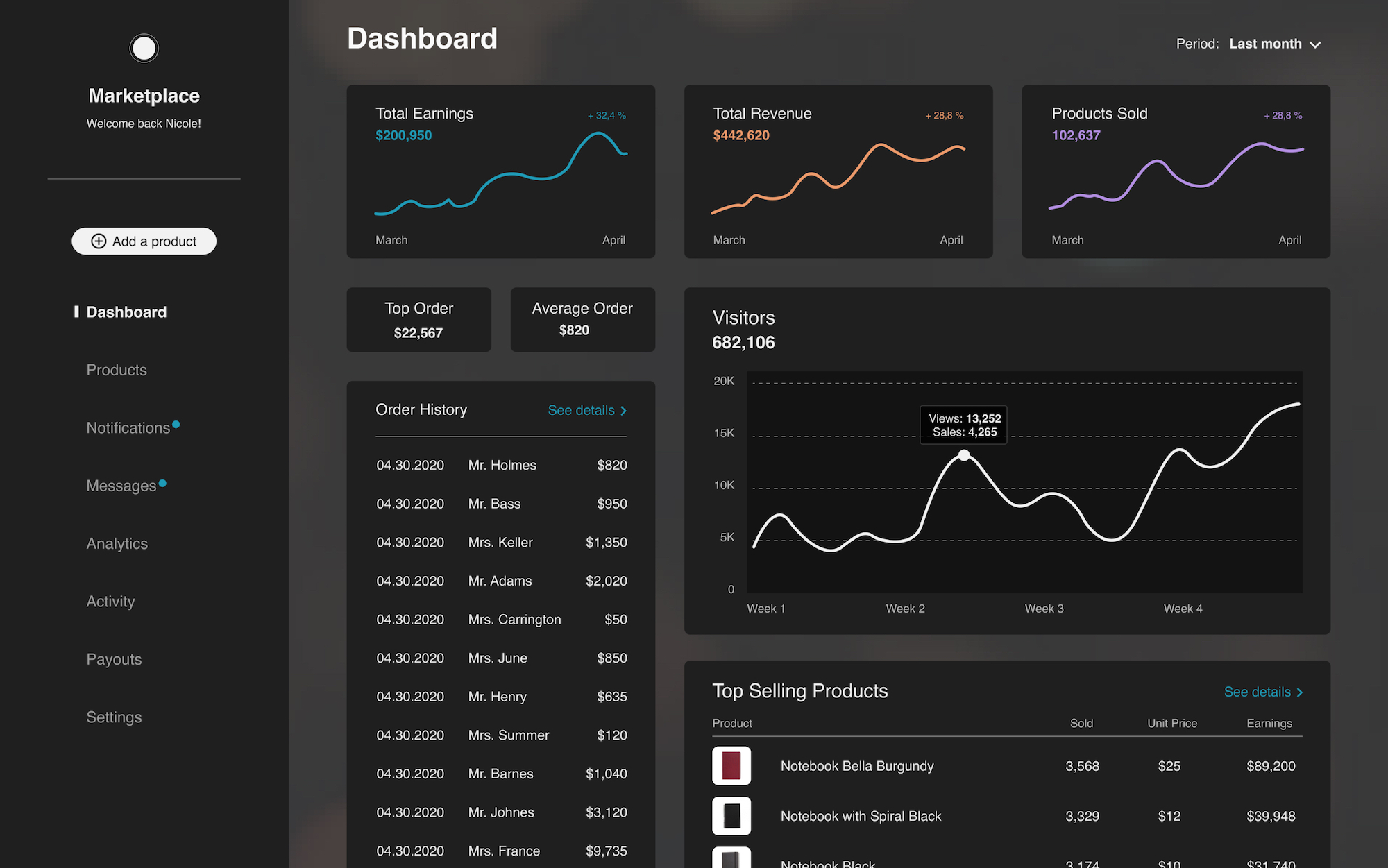
A dashboard is an essential point for business owners as it gives an overview of all the earnings and orders. They can also see how many people visited their marketplace, how many products were sold, and what the best sellers were. It can help them improve their future sales by identifying how their consumers interact with the products.
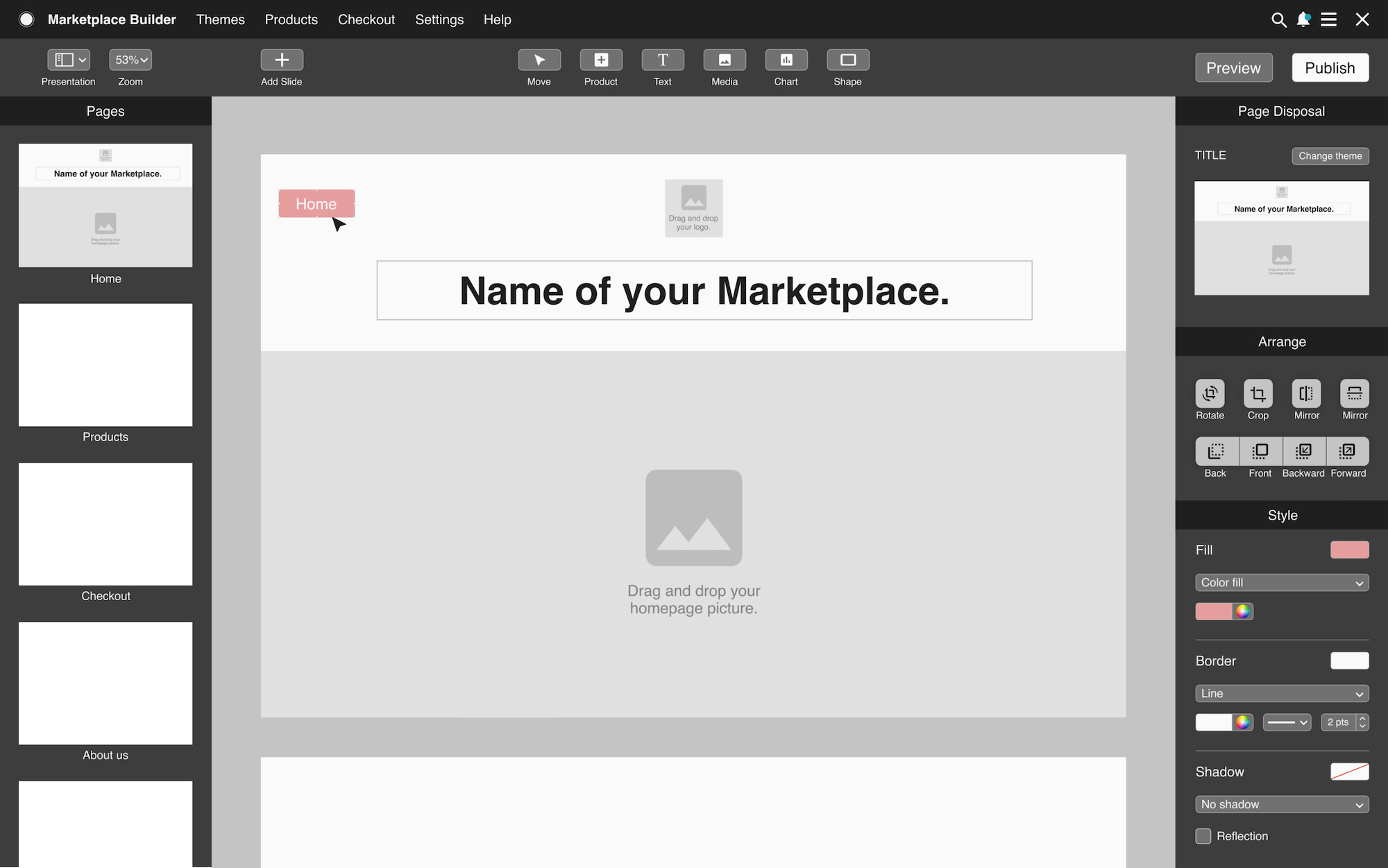
Payever asked for a builder similar to Keynote, but adapted to building a marketplace.
Once the product was designed, I worked on finding images and keywords to enhance this new service, in order to promote it online.
